Landing Page Mistakes Hurt: 10 Real Examples and Solutions to Learn From
- Posted by: Poorti Gupta on 11 Aug, 2017
A landing page is a foremost page that visitors land onto from ads or email marketing. Within first 5-10 seconds of visit, a user decides if they are going to stay or leave. This means you have very less time to showcase what you offer.
You might be scratching your head and wondering that you have a well-designed landing page then why lacking in getting proper conversion ratio.
But my friend, designing is not one and the only thing that is going to yield you great results.
Now you don’t have to worry about what is done, as it is rightly said ‘It is never late to start again’ and all you need to do is learn from others mistakes.
Here, presenting you the 10 real examples and solution to learn from in order to create a landing page that converts visitors into customers.
The headline is the primary thing a visitor notices at your page. It gives the generic idea to the user what your landing page is about and what services you offer.
Most marketers lose their visitors on first place by making the headline boring, vague and meaningless.
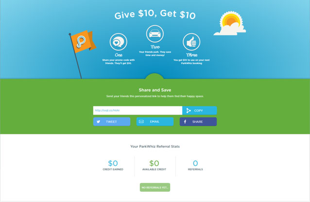
Have a glance at below image.
All you will notice is: Give $10, Get $10.
Now you will be having a puzzled look and following questions in your mind: What does it indicate? What are they trying to sell?
Leaving user with such kind of question will only increase your bounce rate.
The Solutions:
- Headline should clearly give an idea about the content of the page.
- Make sure your reader found headline useful and actionable.
- Make a catchy headline that grabs visitors’ attention. Crazy Egg, co-founder Neil Patel shared informative tips on how to write the engaging headline in his “The Step-by-Step Guide to Writing Powerful Headlines” post.
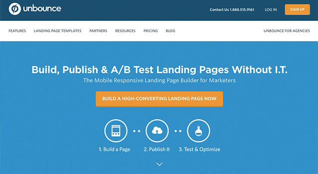
The unbounce headline is one such example that straight to point tells what it provides.
If a user is unable to decode the purpose you want to convey them it will be the biggest misfortune for you despite having a significant design. As your visitor will never be converted to your customer.
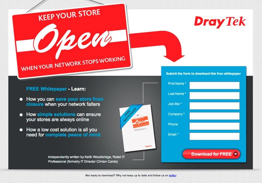
Look at the below image! What do you think they are into?
Their headlines did not clearly communicate what business they are in exactly.
What the product or a service is their business into?
This all confusion can lead to unhappy visitors which can create a stressful situation for you.
How to get most out of landing page?
The landing page should clearly and concisely define the following things-
- What is the page about?
- Explain whether a business is a service or a product based?
- What sort of products or services they offer?
- What is the time limitation for the particular offer?
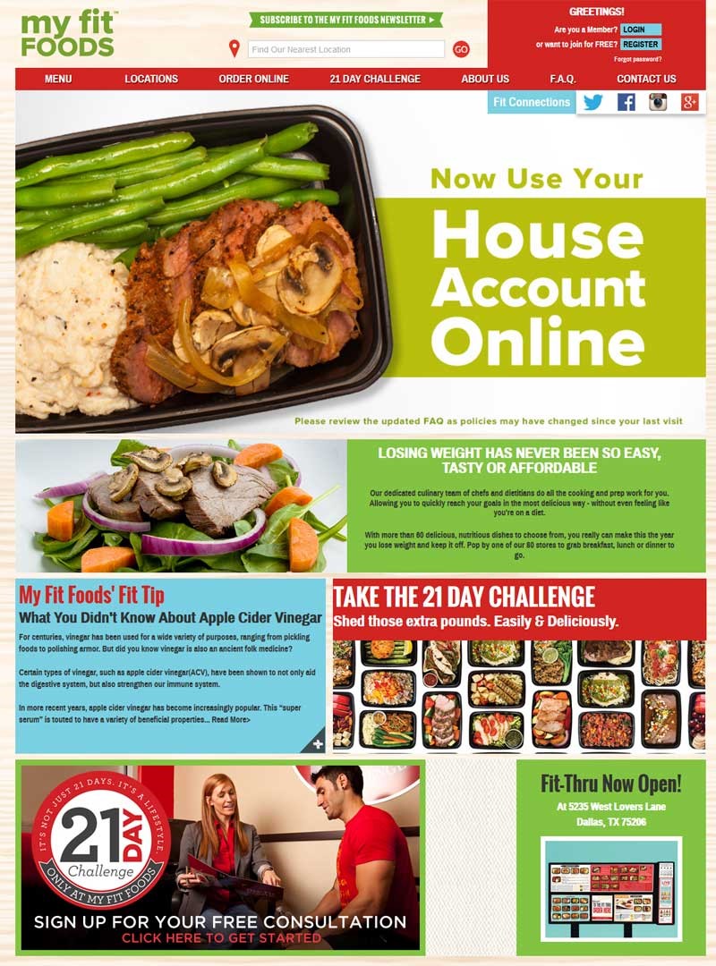
A right image has a tendency to spread information widely. The common mistake marketer do is using a free stock image that is less informative and used by other site members. Another such mistake is overloading the page with too many visuals which distract user instead of getting their attention.
Below image is one such example that confuses the user. It doesn’t clarify what the page is about.
The Solutions:
- Use custom images to increase 35% chance in conversion rate.
- Image of people gazing at the call to action grabs visitor attention to look at it.
- Get rid of any unrelated images.
- Show product image so that user gets a clear idea of what they are going to get.
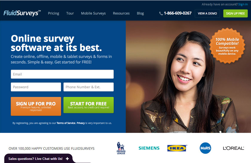
Below is the perfect example of the good landing page. It clearly explains that they are going to provide online survey. Plus the image also catches attention to look at the call to action.
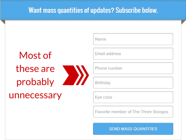
Imagine you just want to download an eBook or sign up for newsletters but you have to fill in the answer for 10 questions. Wouldn’t it be annoying and feels like you are been investigated?
Everyone wants to get things quickly and instantly. Asking for too many and irrelevant information can cause a visitor to bounce from your site to another and you might lose one of your valued customers!
Below is an example of one such form which asks for birthday and eye color. Doesn’t it seem unnecessary and suspicious?
The Solutions:
- Ask only relevant information.
- Keep your form short.
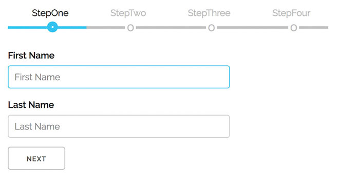
- In the case of needing more information, create multi step form. This won’t create a bad user experience. As shown below:
Call to action is a golden opportunity which you should never miss. Your landing page should clearly dictate visitors what to do next after knowing your services. It should impart immediate action on the page.
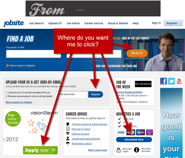
Now look at below image, it confuses visitor in taking action. C’mon! Who would like to think too much while taking an action? Obviously! No one.
How to make a clickable call to action?
- Place the CTA button in such a position that user can easily find it.
- Keep color contrast between your text and CTA button. Your call to action color should stand out by itself.
- Make use of Whitespace wisely.
- Use urgent CTA phrase such as free, new, hurry, now, limited. This will draw their attention.
- Offer one thing at a time.
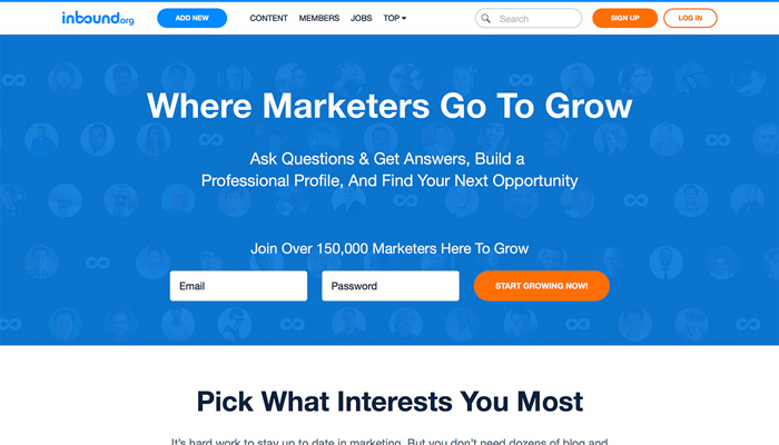
Below image is a perfect example of adequate CTA. It very clearly explains what user is going to get, it uses whitespace ideally that visitor can find CTA button effortlessly, CTA color is also contrasting, CTA phrase is impressive too.
Don’t bombard your landing page with lots of text. People might get confused and won’t understand what you are offering to them.
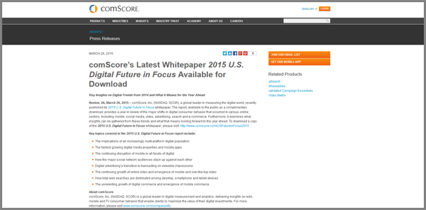
Look at the given image below. comScore provides white paper for download but it is too much loaded with text that its light blue download link barely catches visitor’s eye. Hence it will result in increased bounce rate.
The Solutions:
- Try to explain things in fewer words and get rid of really fancy adjectives.
- Unless and until there is too much detail required you can divide your text in multiple ways such as –
— Bullet points
— Bold Headlines to grab attention
— Subhead points
- Highlight the important lines so it will be easy for the visitor to absorb essential information quickly.
- Make use of images, as one picture worth a thousand words.
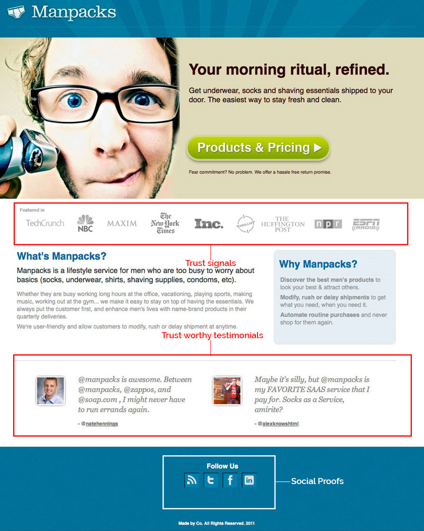
Do you buy the products from the suspicious store? No! Right? So how can you expect your visitor will trust your service if you fail to show trust signals.
How to gain trust?
- Display honest testimonials on your landing page.
- Share a useful piece of information.
- Don’t overstate your services and benefits.
- Incorporate Social proofs.
Above the fold is space which visitors see without scrolling. It is the crucial aspect to make into consideration. If you miss showing important details in this area you are likely to increase your bounce rate.
Which details to include?
- Place call-to-action button in this section where the viewer can easily find it and take action.
- Showcase what kind of business you are into.
- Place information that viewers want to keep reading.
Small things play a really important role in this competitive world. According to Akamai and Gomez.com data on loading time, a user will quit a website if it fails to load within 3 seconds. 79 % visitors who have a bad experience with site performance prefer not to buy from the same site again.
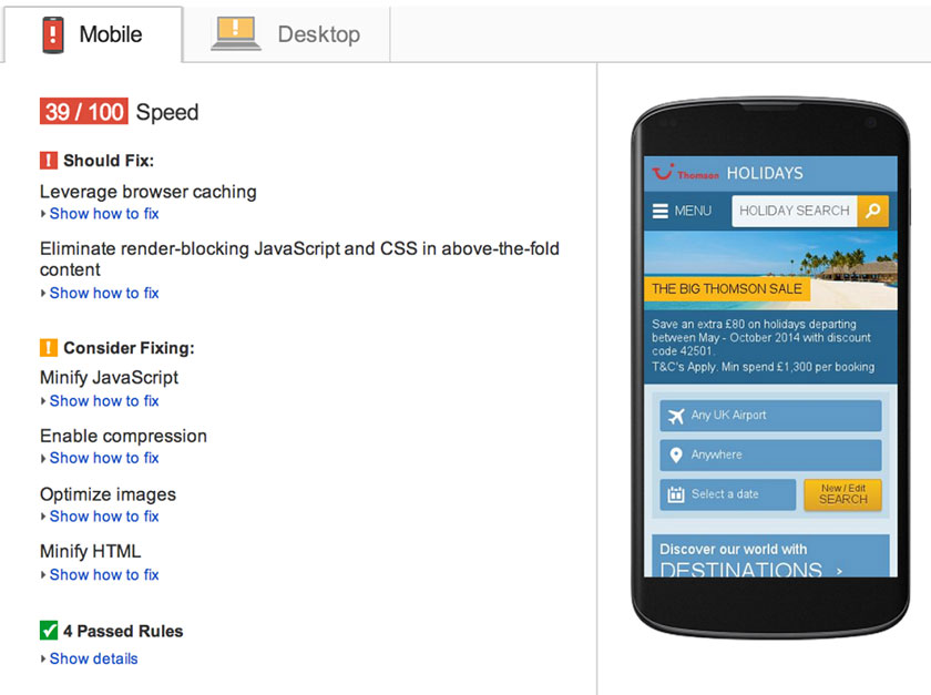
Tips to Reduce Load time:
- Take a speed test using Google’s PageSpeed Insights tool which recommends some solutions like which images need optimization.
- Check your code. Remove unnecessary sections. Minify JavaScript and CSS.
- Large images take too long time to load, leaving negative user experience so reduce and compress the images where required.
- Minimize your 301 Redirect. A number of 301 Redirects can also result in slowing down your speed.
You are selling a product or service and don’t look at how much sales you are doing or what customer is seeking, chances will increase that your business will soon be in loss. Similarly, all your efforts will go in vain if you don’t track and optimize your landing page.
How to keep an eye on the landing page?
- Create several versions of landing pages and keep track on them to see what is working and what not. Change if the conversion rate is not increasing.
- You can experiment by changing your call-to-action, headlines, price, design, and content, to look what changes are working.
- Use analytical tools such as Google analytics to observe how much traffic is coming to your page.
- Keep tweaking and testing timely.
Conclusion
Now you know most common mistake done by marketers. You know how information should be shown, what are the dos and don’ts. Keeping all the above 10 mistakes and quick fix in mind while designing your landing page will for sure help you in increasing your click through rate.
Did you find these tips useful? Do you have any tips to add? Share your thoughts with us.
Poorti is an SEO Executive at Effectual Media. She helps business in generating leads organically by bringing their presence on the front pages of search engines. Her expertise is uncovering new opportunities in content marketing and search engine marketing. She is an avid reader of marketing trends.